Dashboard
As soon as you login into your account, you will see your company dashboard. On the dashboard we show you data that is the most important to your organisation.
Please look below for the explanation on each of the features.
Navigation Bar
This is the top navigation bar.
Note that depending on the permissions assigned to you, you may or may not be able to see all the features.
From this bar you can web clock in and web clock out. You can also click on the user name and see additional options related to your profile.
The bell icon indicated critical notification that are meant for you as a user. This can be leave requests, support tickets etc.
The search box lets you easily find other users in the company. Simply type their name and ClockIt will show you the closest matches.
Filters
These are the major filters that are available to the users. When available they will be enabled.
Both the department and site filters have multi select options.
The date filter can be used to select a variety of date ranges that are available and you can also set custom dates.
By default ClockIt would load with the last 30 days data for all your site and departments put together. Depending on what values are selected in the filters the dashboard values would change.
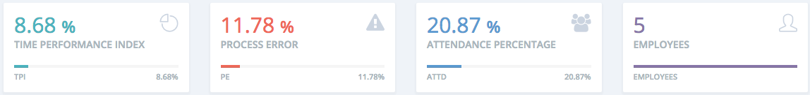
Critical Numbers
The Time Performance Index, Process Error and Attendance Percentage are indicated in the first three boxes and the last box has the total number of employees.
The TPI and the PE have drill down features and you can narrow down by site until the last employee by clicking on them.
Clicking on the employee number takes you the Company > Manage Users.
Time Performance Index Graph
This is the time performance index for the given date range. To know more about TPI please click here.
Process Error and Attendance Graph
These graphs indicate the Process Error and the Attendance Percentage for the given date range.
Top and Bottom Performers
This table shows the top and bottom performers with respect to TPI. Customer generally do ask us why we have this in percentage and not hours. Hours would work great if only one day was selected. User can easily relate to this if only one day is selected. But if a date range is selected it does not make sense to show cumulated hours. Hence the decision to go with percentage. The percentage is calculated based on the Time Templates.
Clocking on the user's name would take you to the detailed user profile.
Yearly Gain and Loss Graphs
These graphs show the gain or loss of time for the full year. A gain is defined as hours that are gained over and above the required work hours as per the time template. Loss is defined as the hours lost as the employee has not completed the shift as per the time template.
The top right of each graph indicates the value and both graphs are colour coded. Darker colours indicate a higher value. In essence you can see periods during the year when the team has been working excess as against less. Usually during busy times of the year you would notice that there are more hours gained and vice versa during a holiday period.
You can also click on individual days to see the total gain vs the total loss on that given day.